Spirex: Designing AI-Driven Clarity for E-commerce Sellers

Spirex: Designing AI-Driven Clarity for E-commerce Sellers

Project Overview

Optimizing E-commerce with AI-Driven Demand Forecasting

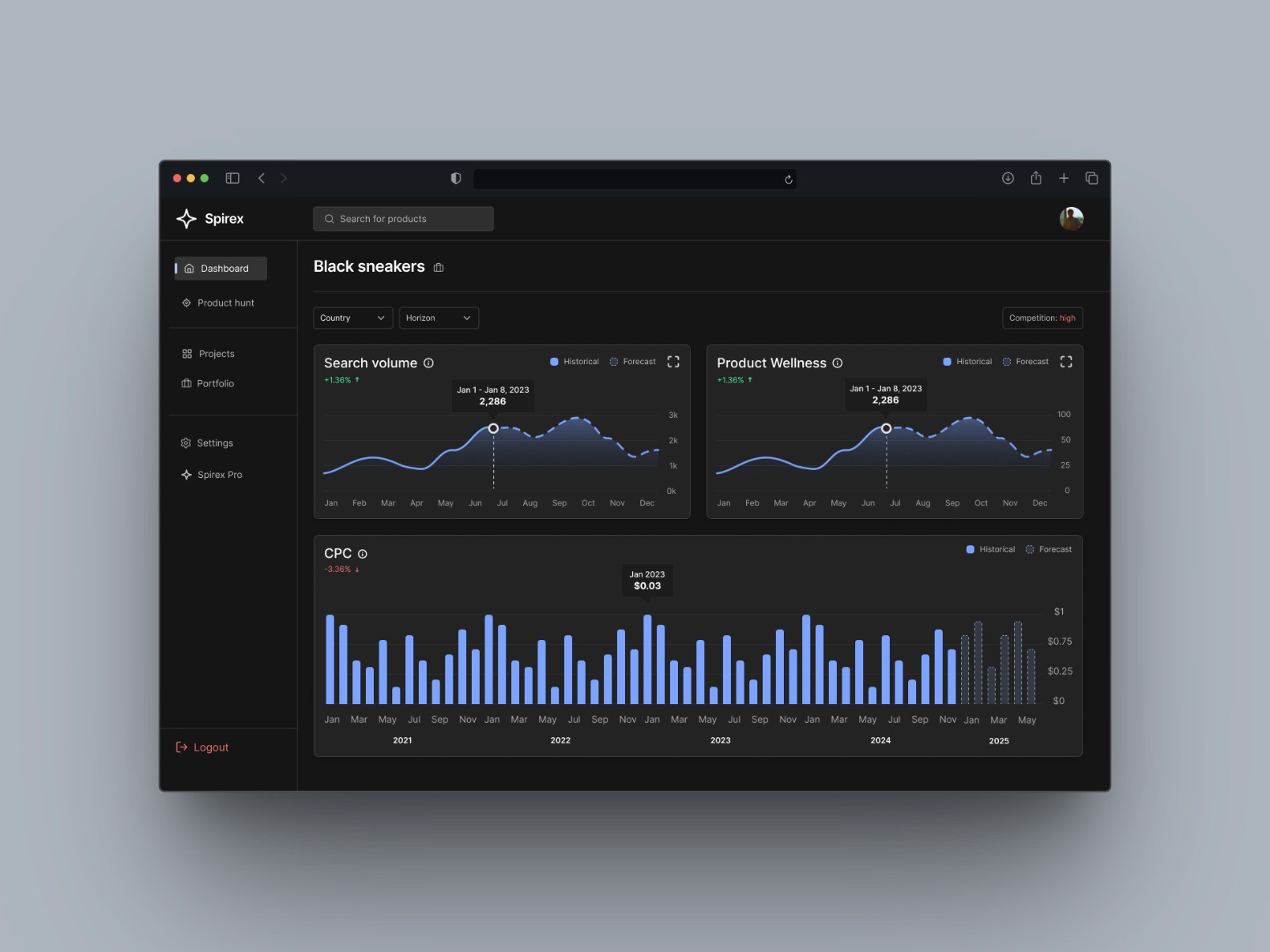
Spirex is an AI-powered demand forecasting tool that helps e-commerce businesses predict product demand, optimize their assortment, and improve their supply chain in just a few clicks.

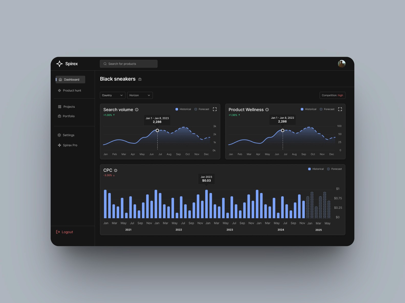
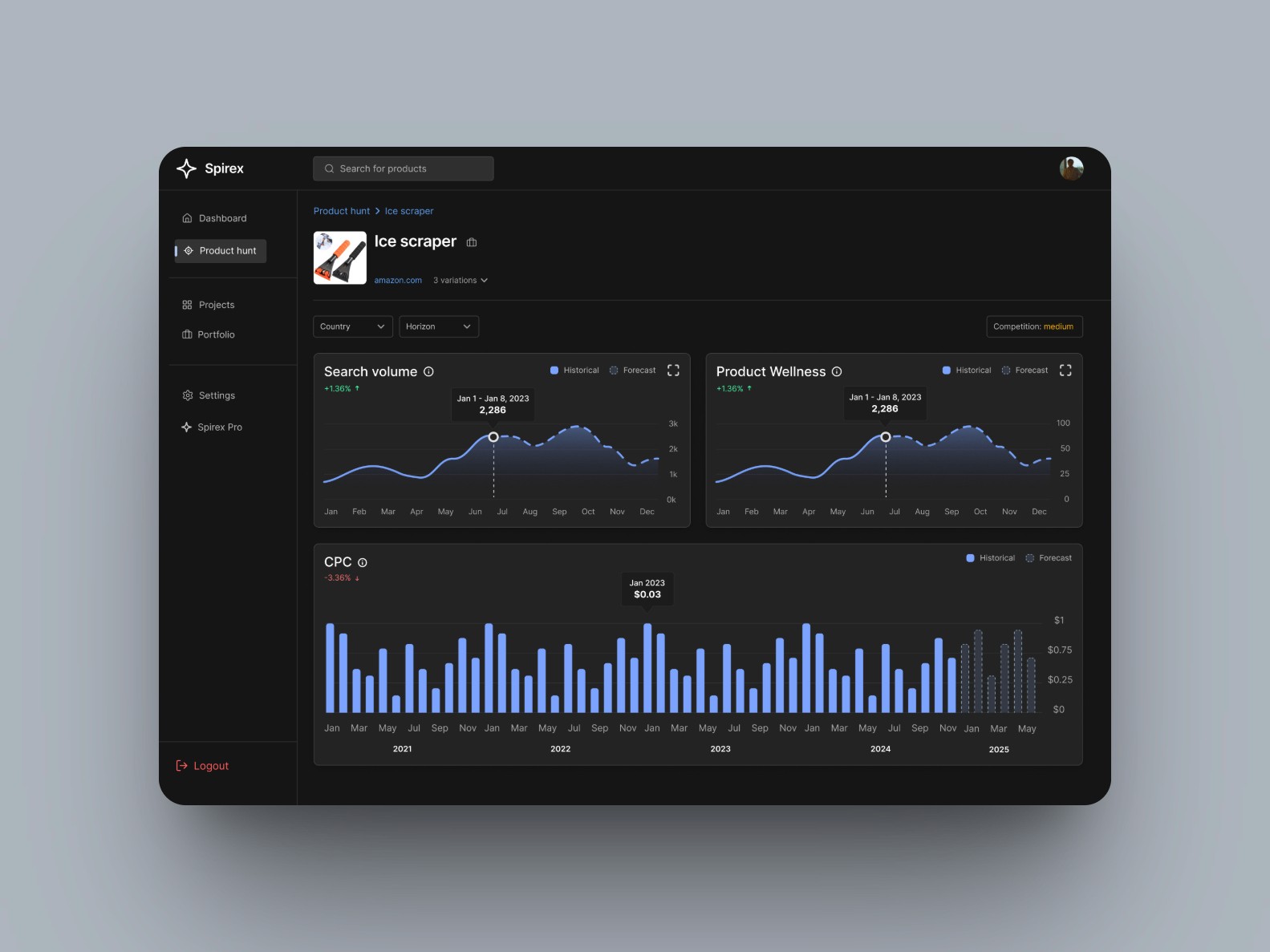
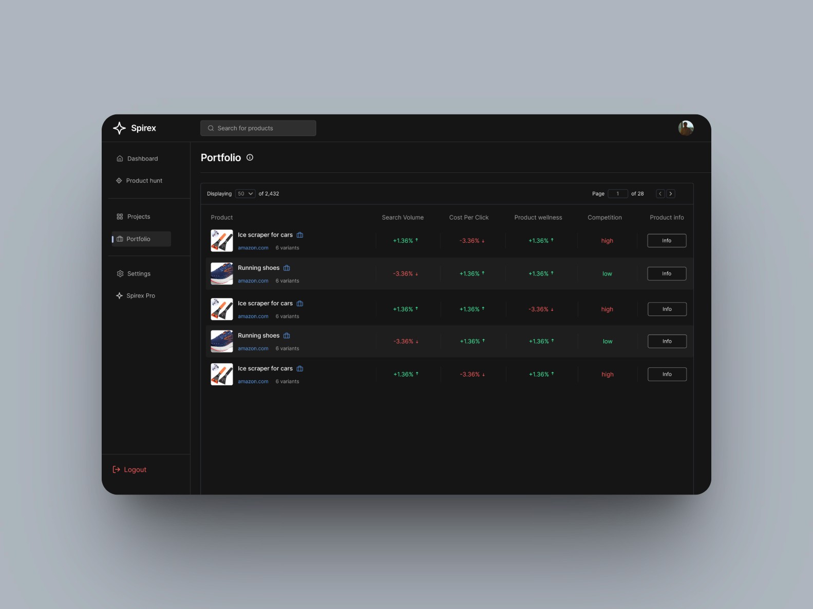
By forecasting key metrics like sales, search volume, cost per click (CPC), and competition rate, Spirex enables merchants to make informed decisions, without needing data analytics knowledge.

As the sole designer, I worked directly with the founder, Vlad, to lead the redesign of the B2C web app. I focused on clarity, accessibility, and usability, redesigning 30+ screens, building a design system, and simplifying the overall experience.

TL;DR: The goal was to simplify how e-commerce businesses forecast product demand by redesigning Spirex into a frictionless, AI-powered tool that predicts product trends, helping them optimize inventory, ads, and sales without needing data skills.

Opportunity

Position Spirex as the go-to AI tool for trend-driven e-commerce growth

The e-commerce space is fast-moving, competitive, and increasingly data-driven, but most small founders don’t have the time or resources to crunch numbers. Spirex is tapping into that gap by helping merchants forecast product demand without needing a background in data analytics. With no strong design foundation in place, I partnered directly with the founder to simplify the experience, improve usability, and build a cohesive visual direction that’s accessible and scalable.

What makes Spirex unique:

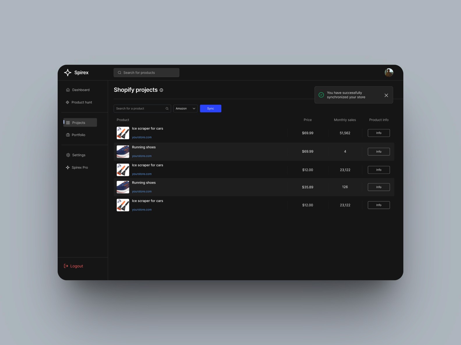
• Predicts demand across 4 key metrics (Sales, Search Volume, CPC, Competition)
• Syncs seamlessly with Shopify & WordPress stores in 3 clicks
• Works across 300,000+ products in multiple industries and regions
• Requires no data analytics background to use effectively

The Challenge

Redesigning an Early Product with Friction Points

Spirex was at an early MVP stage. While the concept was powerful, the product had several usability and interface challenges:

🔴 The interface was overwhelming and visually inconsistent, with little structure or hierarchy
🔴 Users struggled to understand key metrics like CPC and search volume due to cluttered layouts and jargon-heavy content
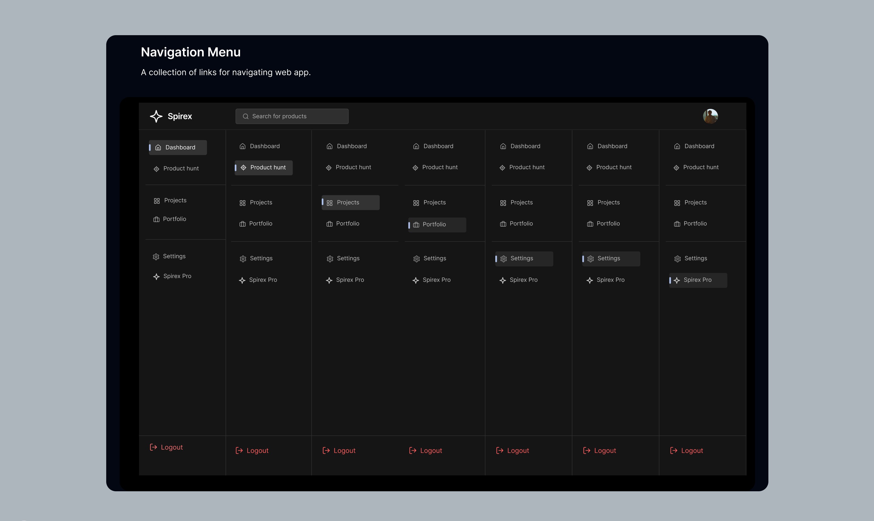
🔴 Navigation was unclear, making it hard for users to complete simple tasks like syncing their store or forecasting product demand
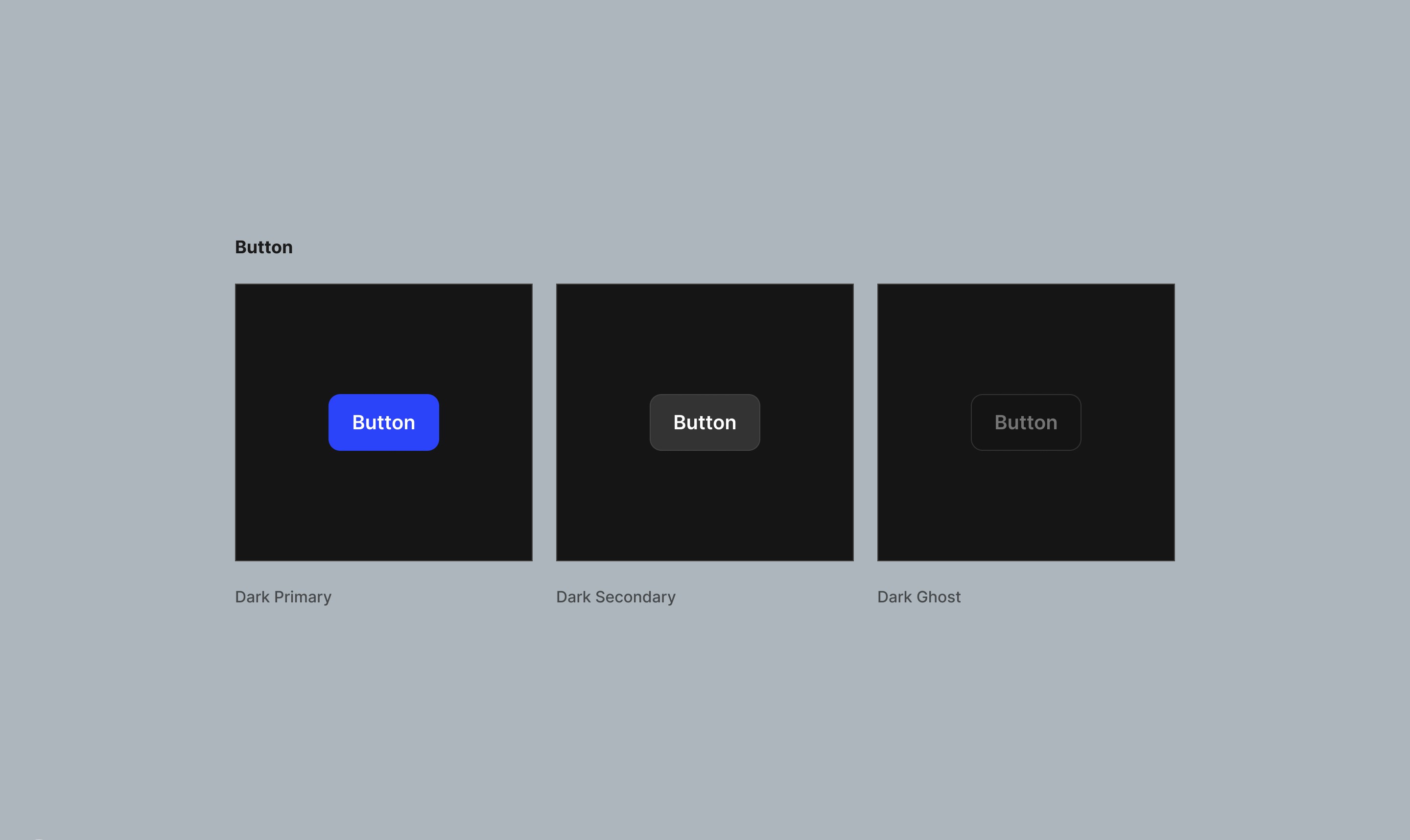
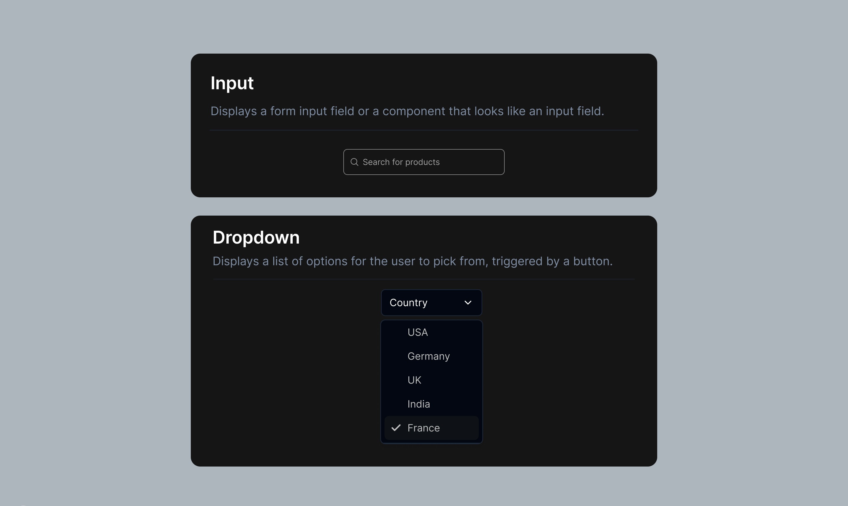
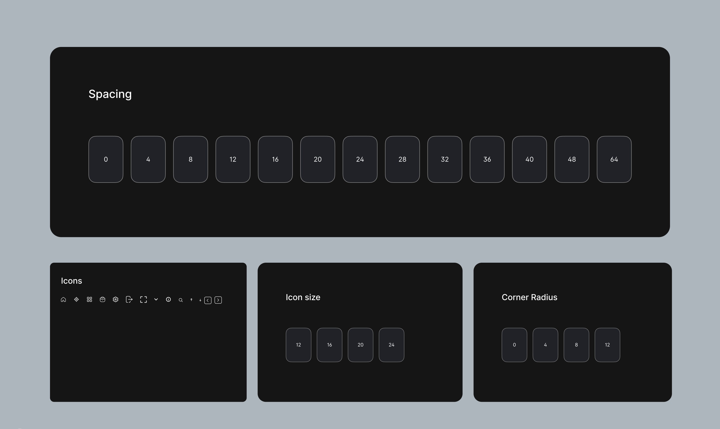
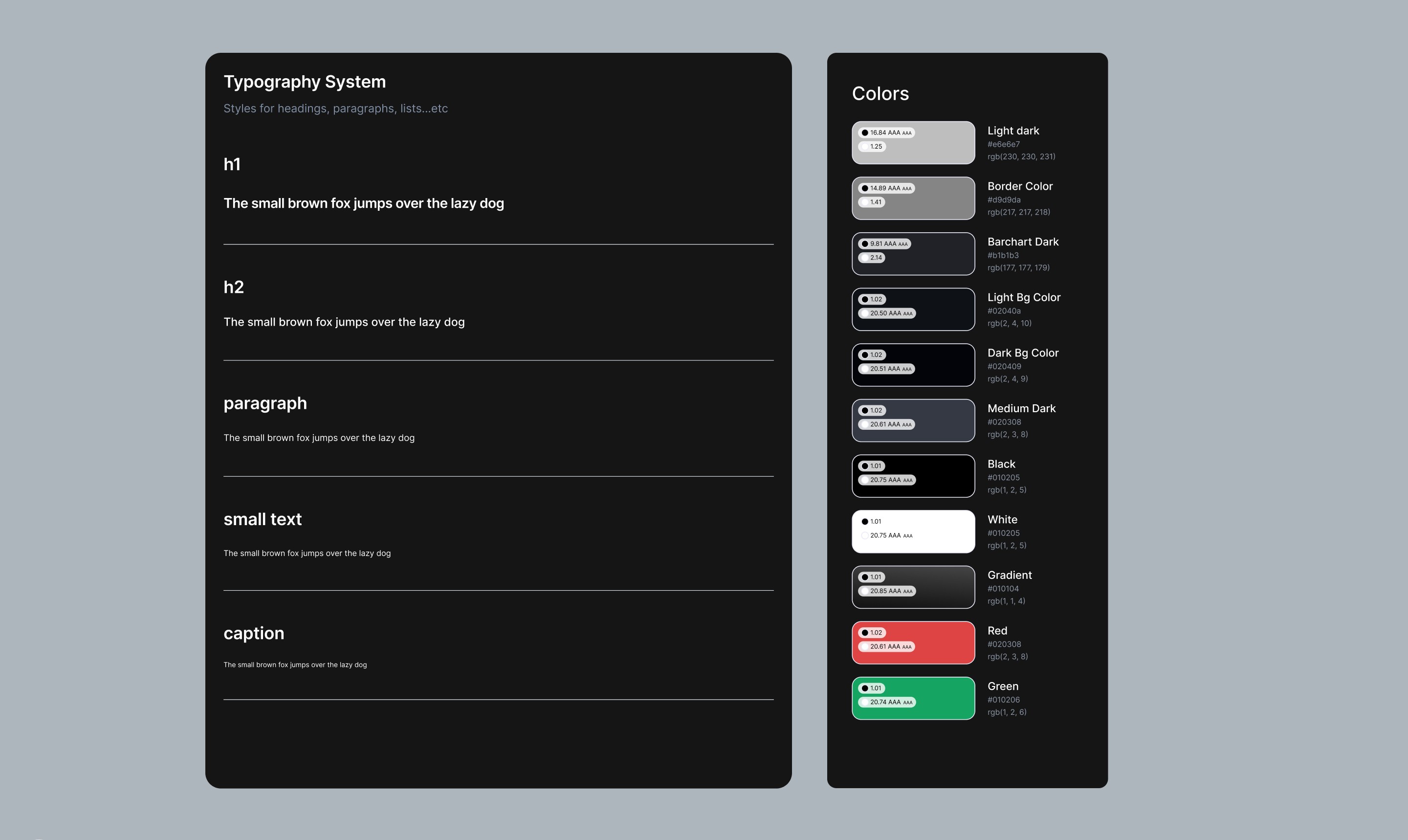
🔴 No design system meant inconsistencies in components like buttons, input fields, and spacing
🔴 Accessibility concerns — low contrast, poor feedback, and lack of affordance in clickable elements

My Process: A Lean Yet Impactful Redesign Approach

Since Spirex was still in development and moving fast, my approach was lean and iterative. Here’s how I worked:

[01] Discovery & Opportunity Mapping

I began by auditing the existing platform to uncover key usability issues and friction points that could confuse or overwhelm users. To better understand Spirex’s position, I ran a lightweight competitive analysis, focusing on similar SaaS tools and Shopify plugins. I also collaborated directly with the founder, Vlad, to align on business goals, user pain points, and technical constraints early in the process.

[02] Simplifying the User Experience

I restructured layouts to reduce cognitive load and create clearer user flows from store syncing to forecasting. The navigation and overall screen hierarchy were redesigned to make movement between sections more intuitive. I also removed redundant steps in core actions, resulting in a faster, smoother experience that'll help users stay focused on insights.

[03] Visual Redesign & Accessibility

To modernize the platform, I introduced a cleaner User Interface with strong visual hierarchy and improved color contrast for better accessibility. I ensured key elements like text, buttons, and icons were easily readable and understandable at a glance. I also defined clear interactive states; such as hover, active, and focus, to give users feedback during interactions.

[04] Building the Design System

I developed a scalable design system covering core components like buttons, input fields, typography, iconography, and layout grids. Each component included multiple states (default, hover, disabled, etc) to support consistency across the product. This system helped speed up design iterations and made handoff to development more efficient. Small microinteractions, were also added to enhance the overall feel.

UX & UI Enhancements

I Created a clean, modern visual style with a focus on clarity and usability

Design System & Components

A consistent foundation was critical for Spirex as it scales. I built a modular, extensible system including:

Button States – Hover, focus, disabled, ghost buttons
Input Fields – Text, dropdown, multi-select with error states
Typography System – 3 heading levels, body text, captions
Spacing Rules – 4pt-based spacing scale
Icon Set – Harmonized style across the product

Final Thoughts

By redesigning the UI, simplifying the UX, and building a strong design system, I helped Spirex create a more accessible, visually clear, and scalable AI tool for e-commerce merchants.

What’s next?
I’m currently working on the Spirex website, shaping its visual direction; but since it’s still in progress, I won’t be including it in this case study just yet.

Words from the founder

I had the pleasure of working with Timi as the UI/UX designer for our B2C web application and website development. From day one, Timi demonstrated exceptional ability to make smart, efficient design decisions. His strong UI expertise guided our design process effectively, while his analytical thinking and problem-solving skills significantly accelerated our development timeline.What truly set Timi apart is his outstanding communication and reliability.

Vladyslav Sushchenko

Founder & CEO, Spirex

Have a project idea in mind? Let’s chat about how we can bring it to life— virtually, from anywhere in the world!

Have a project idea in mind? Let’s chat about how we can bring it to life— virtually, from anywhere in the world!

Have a project idea in mind? Let’s chat about how we can bring it to life— virtually, from anywhere in the world!

Create a free website with Framer, the website builder loved by startups, designers and agencies.